Product Hunt Launch Video Requirements and Format
Video boosts Product Hunt signups over two times more than launches without one.

Product Hunt gets 4.2 million monthly unique visitors as of April 2026. On a busy Tuesday, thousands of launches are fighting for the same scroll. I've watched enough of these go up to say the video slot is where most makers either buy themselves ten extra seconds of attention or lose the visitor entirely. This piece walks through the technical rules, the format arguments, and why video correlates so hard with signups, mostly so you don't have to find out the hard way on your own launch morning.
The hard technical rules for submitting a video
Only YouTube links work, according to Product Hunt's own Help Center. Not a direct upload, not Vimeo, nothing else. Paste the full URL, too, since I've seen a shortened link sit dead in the gallery for an hour before someone noticed.
The video has to be public or unlisted. Private videos just won't render, and this trips people up more than you'd guess, usually because someone uploaded a draft version, forgot to flip the visibility setting, and didn't catch it until launch traffic was already rolling in.
Test the link before launch day, not the morning of and not five minutes before the window opens. Click it yourself on your phone and watch it play.
A couple other things about how the gallery actually behaves:
- Images run at a recommended 1270×760, and you need at least two before the gallery even shows up
- Add a video and it appears alongside your screenshots in the gallery. That trade-off is real, and it's worth thinking through before you commit the slot
Then there's the thumbnail, a separate file from the video and one people underrate. It displays at 240×240, so upload something closer to 600×600 as your source. JPG, PNG, or GIF, under 3MB, ideally under 1MB so it actually loads fast. GIFs only animate on hover, which is worth remembering before you build one assuming autoplay. Strobing effects or text too small to read can get your thumbnail edited by the Product Hunt team, so don't try to get cute with it.
Round out the listing with your tagline (60 characters, and it needs to say what the product does for a person, not just name a category) and your description (260 characters max). If your product's workflow is too tangled for a 60-second clip to cover, Arcade, Storylane, or ScreenSpace can drop an interactive demo into the gallery as a backup.
How long the video should be, and why nobody agrees
There's no official length rule, which is exactly why every guide online quotes a different number. Screenhance says 30 to 60 seconds in its 2026 guidance. Vibrantsnap, working off more than 200 launches, lands on 45 to 90. LaunchList says 60 to 90. Flowjam goes shorter, 15 to 45, built entirely around silent viewing. DemoPolish just names 75 seconds flat, while Siift.ai's 2026 material says under 60 and leaves it there.
None of them are wrong, exactly. They're describing different animals. A founder's Loom recording runs a different length than a polished screen demo, which runs different than an animated explainer. The disagreement isn't really about time; it's about which format each source had in mind when they picked their number.
My honest read: 45 to 75 seconds is where most current guidance clusters, and 90 seconds is close to the ceiling nobody wants to cross. But the number itself isn't the real fight. A 30-second video proving one thing cleanly beats a 90-second video wandering through five things loosely. If you can land your product's whole value in half a minute, tacking on another 60 seconds doesn't strengthen the case. It just hands the viewer more time to tap away.
Why video correlates so strongly with upvotes and signups
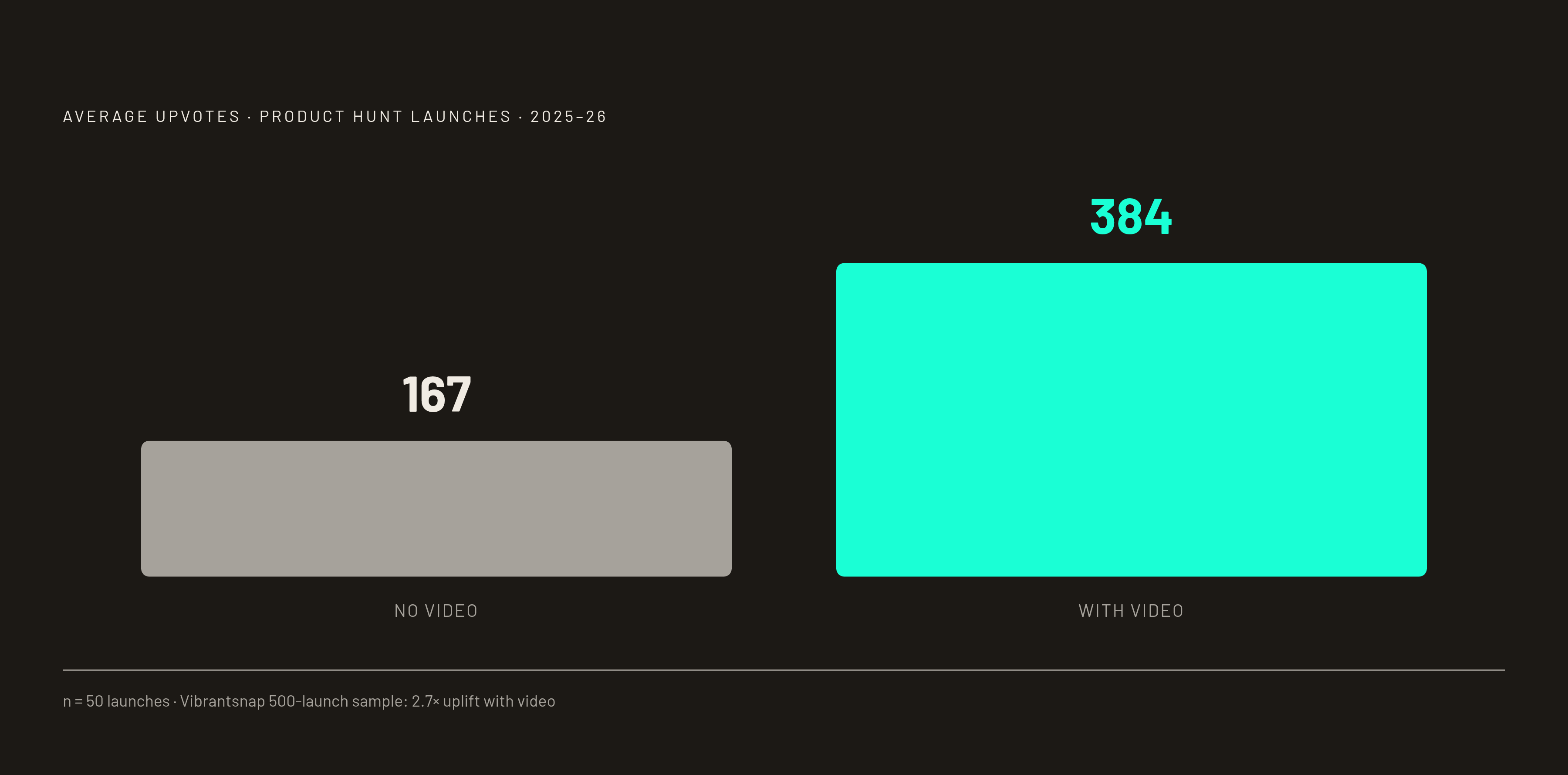
The numbers aren't subtle. A study of 50 real launches from 2025 and 2026 found 38% had no video at all. Those launches averaged 167 upvotes, while launches with video averaged 384 — more than double. Vibrantsnap's bigger sample, over 500 launches, found video-equipped products pulling in 2.7 times the upvotes on average. And per Product Hunt's own launch guide, roughly 53% of Product of the Day winners since 2021 shipped with a video.
Two different things are happening here, and I think they get lumped together too often. Video signals editorial quality to the curation team, which affects whether you get featured at all, and featured status is the real prize: non-featured products have been reported to see around 70% less traffic regardless of upvote count. Separately, video keeps people on the page longer. Someone who sits through a 60-second clip is a different signal to the algorithm than someone who lands and bounces in four seconds.
There's a nuance buried in the maker forums worth pulling out: video doesn't always change whether someone upvotes. It moves the needle much harder on whether that person actually signs up or buys afterward. That's the number I'd care about anyway; upvotes are nice, but they don't pay rent.
None of this makes video mandatory. A weak or off-brand video shoves your good screenshots out of the prime gallery slot, and that's a genuine cost. If you're B2B, API-first, or pre-revenue with barely a UI to show, a tight, well-shot still gallery can beat a video that got thrown together at midnight before launch.
Silent-first design, or how people actually watch these things
Here's the detail that should change how you script and edit everything: video on Product Hunt is widely reported to autoplay muted. The viewer has to tap to turn sound on, and most never bother. Pair that with over 60% of Product Hunt traffic coming from mobile, per Vibrantsnap, and the math gets blunt fast. The majority of people watching your video will never hear a single word of it.
If your first three seconds rely on narration to land the point, most of your audience misses it completely, gone before you've said anything.
A few production choices follow directly from that:
- Burn subtitles into the video itself for any narration. Auto-captions a viewer can toggle off don't count for anything
- Use on-screen text to carry the context narration would normally handle
- Build the whole story so it works with the sound off, beginning to end
Flowjam's silent-first spec gets specific: 1080×1080, under 30MB, captions burned in rather than optional. Good baseline even if you skip their exact format.
Sound still earns its place, to be clear. Music and voiceover reward the smaller slice of people who do unmute, and a decent soundtrack makes the whole thing feel less thrown-together. Just don't let the core message hinge on it. Treat audio as a bonus layer, not the load-bearing wall.
What the video should show, what order, and what to cut
The first three seconds decide whether anyone sticks around, so skip the windup entirely. No logo animation, no loading spinner, no black screen with text fading in over three beats of silence. Open on the product itself, or the outcome, or the exact promise sitting in your tagline. The maker community is pretty unanimous on this point: lead with whatever makes your product different, not whatever makes it feel familiar.
Your opening line, spoken or on-screen, should say who this helps and what changes for them, not which feature you shipped. Nobody watching second three cares that you built "smart batch export." They care that their weekly report now takes two minutes instead of forty.
The middle section has exactly one job: prove one claim with real product motion. Show the interaction a screenshot can't capture, the thing that only makes sense moving. Resist listing features. One capability, shown clearly start to finish, converts better than five capabilities mentioned in passing and proven in none of them.
End with an invitation to visit, try, or leave feedback rather than a request for an upvote. Asking outright for upvotes reads as tone-deaf inside this community, and it can cost you socially even when it doesn't touch the algorithm at all.
Openers to avoid, based on what keeps showing up in postmortems across dozens of launches:
- Logo animations
- "Hi, I'm [name] and today I want to show you..."
- Mission statement slides
- Feature lists read aloud, one by one
- Anything that sounds like an investor pitch deck
The video's whole job is proving the product works, in motion, in sequence. A still gallery can't do that in the same handful of seconds no matter how good the screenshots are.
Picking your format: polished demo, founder walkthrough, or animated explainer
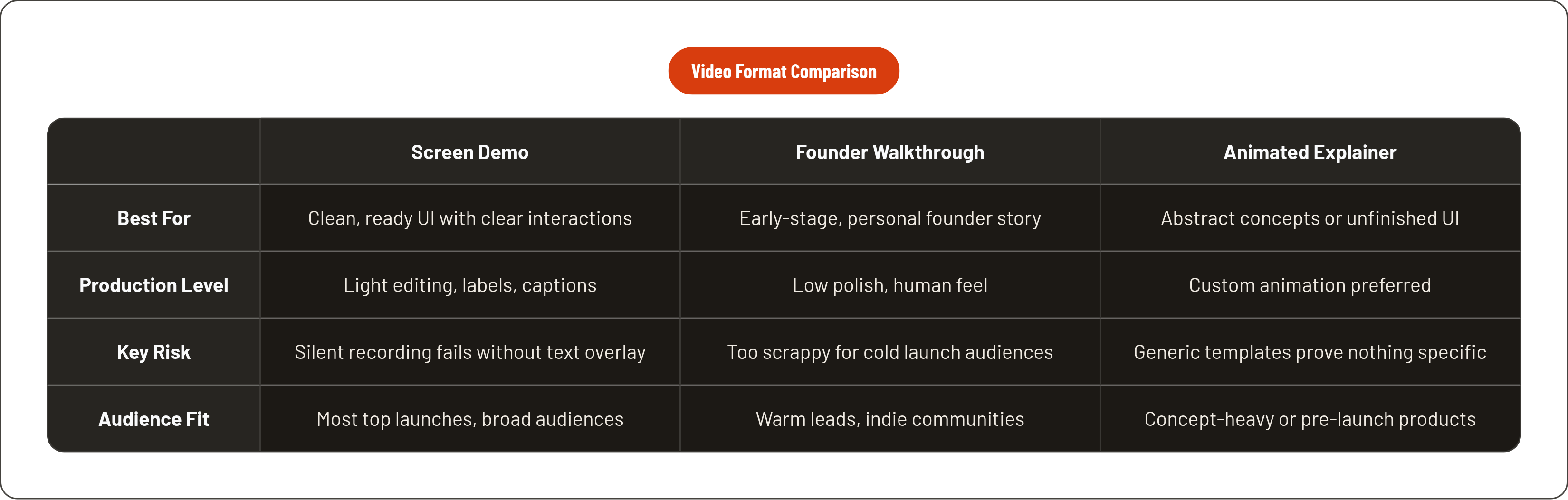
Three formats show up again and again on Product Hunt: the clean screen-recorded demo, the founder-led walkthrough, and the animated explainer. Each one suits a different situation, and grabbing the wrong one for your product is an easy, avoidable mistake.
The screen demo, lightly edited, is what most top launches use. It works when your UI is already clean and the core interaction reads clearly without much explaining. It still needs on-screen labels and burned captions, though; a silent screen recording with zero text overlay fails the muted-viewer test just as badly as a talking head with no captions does.
The founder walkthrough, Loom-style, trades polish for trust. It feels human, and inside communities like Product Hunt, Indie Hackers, and LinkedIn, that carries real weight. It doesn't need to look expensive; looking too slick can actually undercut the format. The catch is audience temperature. Flowjam's framing gets this right: the colder the audience and the higher the stakes, the more production quality you owe them. A scrappy Loom works fine for a warm lead who already half-trusts you. A launch day audience of total strangers scrolling past a thousand other products deserves more than a scrappy Loom. This format fits best for early, single-founder products with a personal story worth telling.
The animated explainer earns its spot when the UI isn't ready yet, or the idea itself is abstract enough that no screen recording could make it click. The risk is sounding like everyone else: template animation that looks like every other SaaS explainer ever made, proving nothing specific about your product. Custom animation built from real knowledge of what you're actually selling beats the template version every time.
Short on time? Don't let that stop you: in the same 50-launch study from earlier, a concise screen recording was enough to carry a launch. For genuinely complicated SaaS workflows, a purpose-built demo compressing your differentiated value into 60 seconds usually beats a founder walkthrough shown to a cold audience with zero context on who you are. That's the specific gap a purpose-built demo service can fill.
Where the video sits inside the rest of the listing
The video sits first in the gallery, but the gallery is one piece of a bigger listing: your thumbnail, tagline, description, and the first comment you post as the maker.
That last one carries more weight than people expect. Per Product Hunt's own launch guide, 70% of products that reached Product of the Day, Week, or Month had a maker comment posted first. The video gets the click, while the comment keeps people talking once they've arrived.
In 2026, engagement signals — comments, maker replies, time on page — matter alongside raw upvote counts in Product Hunt's ranking. So the video's actual job is generating the engagement that carries the rest of the listing forward, not serving as a finish line on its own.
Run through this specifically before launch day:
- Confirm the YouTube video is uploaded and set to public or unlisted
- Copy the full URL, not a shortened one
- Watch it muted, start to finish, and check that the story still lands without sound
- Look at the first three seconds on an actual phone screen
- Confirm the gallery has at least two images beyond the video
A great video next to a flat tagline or a missing first comment still leaves upvotes and signups sitting on the table. The listing works as one system. Treat the pieces like separate assets that happen to share a page, and that's usually where the whole launch quietly comes apart.