SaaS Explainer Video Storyboard Structure and Flow
Nail the narrative sequence before worrying about animation polish.
SaaS explainer videos rarely flop because of spending limits, visual polish, or voiceover refinement. Structure is what matters. Even a slick production following a flawed narrative order loses out to a rougher cut that nails the flow. Marketing departments need to shift their focus away from debating animation aesthetics and toward mapping out the sequence of events and its rationale.
Chili Piper's explainer drives the point home. The production quality is unmistakably high-end, with visuals polished to an enterprise standard, and its problem-solution arc lands exactly as it should. It closes with "Visit our website". All the money poured into building momentum toward a choice ends up returned to the audience with nothing left to choose. The failure is structural, rooted in the one moment meant to complete what everything before it set in motion.
What a storyboard does in the production pipeline
Storyboarding turns a script's broad beats into concrete visual choices: what goes on screen, the order it appears in, and the time each piece stays there. It links the video's message to the viewer's experience, while errors at this stage cost more to fix later, after animation is already underway.
Scene by scene, the storyboard pairs an image with each part of the script, settling what the viewer looks at during every line of narration. Finalizing those pairings early spares the team expensive revisions after animators begin drawing. The rule is straightforward: one main idea per frame. Any frame whose meaning isn't instantly clear needs fixing prior to animation.
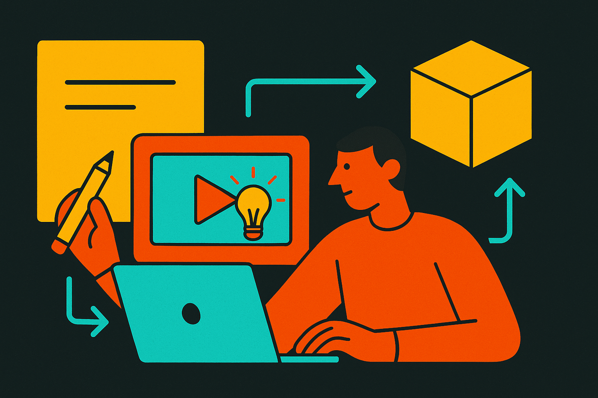
The workflow for a strong storyboard usually moves through five stages. It begins by pulling out the dialogue cues, branded imagery, and feelings the scene needs to land. Next, thumbnail sketches check the sequence’s pacing while it is still kept loose. After that, detailed frames indicate how movement and cuts should play. The fourth step asks the team for feedback about how the story sounds and reads. The fifth hands off the last annotated draft to the people doing the animation. Nothing about it is ornamental. It ensures the writing, design, and animation teams share a single visual logic before anyone produces a single frame.
At this stage, the common mistake is making things too complicated: cramming more information into one scene than it can carry, which forces the viewer to work just to parse what's on screen. When a frame takes effort to decode, a medium meant for speed and clarity gives up its whole advantage.
The six-beat arc that high-converting SaaS explainer videos share
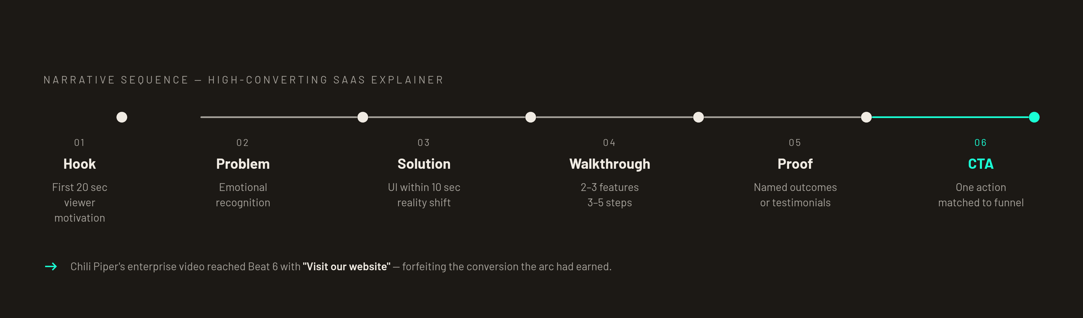
The six-beat sequence Hook, Problem, Solution, Feature walkthrough, Proof, CTA shows up across independent frameworks. It recurs because of how attention works, not because of convention. Every stage wins focus for the next, so moving one out of sequence snaps the thread.
PVSCA sequences move through Problem, a Visual hook, then Solution and Call to action plus Authenticity. PAS, the earlier model, follows Pain, Agitate, then Solution. When an AI-tested sequence organizes this material, it uses Problem, Friction, Product, Workflow, Outcome, CTA. The vocabulary shifts, but the shape holds: name the pain, acknowledge that relief is possible, trust this product to provide it, prove that belief, then act. Buyer attention and trust build beat by beat that way. They all arrive at the same structure since it reflects genuine viewer psychology rather than imitation.
Notion's video follows this shape closely. It opens on a problem nearly every knowledge worker recognizes, information scattered across too many tools, before the product appears. Its messaging stays focused on outcomes ("calm, clear place to focus") rather than listing features. Pipedrive does something similar with even more restraint: one promise, "We make sales easy," no feature sprawl, no secondary storylines competing for the viewer's attention. One idea, one outcome, one message.
Timing still matters, though it should steer the work rather than bind it. The whole arc takes at most a minute and a half; an explainer stretching to three minutes usually means its makers never settled on one message. Length is not the point. When a piece drags on, that typically signals its makers are chasing three messages rather than settling on a single one.
The Hook and Problem beats in the first 20 seconds
An explainer video's first seconds act as a commitment device, with the Hook offering the viewer motivation to stay and the Problem beat shifting that focus toward emotional recognition before the product appears.
Some openings reliably shut engagement down. Lines like “We are a company that…” and “Introducing our platform…” put the product first, so viewers tune out almost immediately. A stronger hook starts with what the audience recognizes in its own day: “Still spending hours doing X manually?” or “Struggling with [specific pain point]?” It pulls viewers in before the product is even named. Notion’s video does the same, first showing the scattered-tool mess its target viewer already knows, long before any product screenshot appears.
Deel's explainer goes against the problem-first pattern and still works. It leads by introducing the company itself rather than naming any particular pain, establishing rapport ahead of function. That lead holds up rather than turning into a sales pitch because Deel makes viewers see themselves in it. So the guideline isn't "never open with the company." What matters is that the opening centers on the viewer somehow, whether via a pain point or via a feeling of shared identity.
Once the Hook has the viewer looking, that focus must be directed carefully by the Problem beat. If the problem is vague, the motivation will be vague too. When viewers can immediately recognize their own situation in the scene, they become more eager for the fix that comes next. In the storyboard, shot selection takes on a clear job: close-ups show emotion, wide shots show context, dynamic angles show energy, and each choice needs to support the beat it belongs to, not just add visual variety for its own sake.
What the Solution and Feature walkthrough beats must prove
The Solution beat frames the product as the natural fix for the pain laid out in the Problem beat. What comes next is the Feature walkthrough, whose sole aim is making that fix believable. Plenty of storyboards fail because they treat this section like a product demo, which is a separate format meant for later in the funnel and built for viewers who are already scrutinizing the offering. Inside an explainer, the walkthrough exists only to back up the solution claim made right before it.
During the Solution beat, present the product as a shift in the viewer's reality once they start using it. Top videos reinforce this by showing actual product UI no later than 10 seconds after the solution appears. Doing so establishes credibility, reduces vagueness, and resolves the doubt that motion graphics leave hanging: does this thing truly exist?
The Feature walkthrough that follows should limit itself to two or three features at most, each picked because it directly proves the solution claim. The strongest explainers trace one use case across three to five steps, ending at a single clear outcome. Rather than adding information, they condense it.
Mixpanel presents a long parade of capabilities, from tracking to reports to insights extraction. By trying to cover the full platform, it becomes too much for someone who has not reached the point of caring. Slack's video runs into a different issue: its feature tour stays detached from any real pain point, so viewers learn what the product does but not why their team should want it, draining the feeling that the Solution beat needed to create.
Why Proof and CTA are structural beats, not afterthoughts
Belief becomes confidence through proof. A named customer outcome, a concrete result figure, or a testimonial from a real person shows the viewer that the solution claim survives outside checking. Zeliq’s video skips the testimonial card and frames outcomes instead, centering what the platform can solve as a force that multiplies the sales team’s reach, with the payoff being sharper prospect talks and leads of higher quality. This is evidence shown through results instead of testimonials, and it succeeds because it is concrete instead of ornamental.
A CTA needs to satisfy two conditions together: the viewer's stage in the funnel, plus the placement of the video on the page. Someone brand-new sees "Try free." A prospect already qualified and closer to a purchase sees "Book a demo." Relying on one all-purpose CTA template in every situation weakens the response in both cases. It must remain single as well: offering viewers several choices at the close, such as signing up, watching a demo, or learning more, scatters the decision rather than steering it.
shows no clearer case than Chili Piper's video of the cost when this beat is omitted instead of developed. Despite the enterprise-grade cinematography, the CTA closes with "Visit our website," offering no concrete action for the viewer and forfeiting the conversion the structure had been building toward. Only once the audience can see an obvious, effortless way to respond is a storyboard complete, since that route carries the same structural weight as the opening Hook or Problem beat, which is the problem Letterspade tackles for technical startups by treating video as a sales tool first.
Frame-level rules that keep pacing from breaking the beat sequence
A well-ordered arc can still break at the frame, where choices about cuts, visuals, and transition timing end up supporting the beat or quietly undoing it.
Visual pacing has to follow the script: cut each time a new idea arrives, and keep any shot on screen for three to five seconds at most. Holding a shot beyond its purpose lets the audience's focus drift away. The principle of limiting each frame to a single idea, established during storyboarding, carries straight into execution. When an image fails to communicate instantly, simplify it prior to animating, since excessive complexity remains the top error during this production phase.
Pick shots based on what the story needs, not on mixing things up just to look varied. Close-ups convey feeling and specifics. Wide shots set the context. Dynamic angles bring energy. The right choice for any frame comes down to what that beat has to get across, not a wish for constant visual novelty.
Plan separately for mute viewing, since it shapes the structure rather than serving as a final production fix. Since most Facebook videos play without audio, the storyboard has to make its point through captions and on-screen copy on their own, apart from the voiceover. So plan the text style into each frame note early, before the animation cut is finalized.
Such considerations never supplant the argument built on beats. Rather, it bolsters that claim: structural design charts the path audiences follow, while timing at the frame scale holds their attention until the finish. The rule applies no matter who writes the script: visual outcomes depend on beat order long prior to aesthetic judgment.
Sources
- 25 Best SaaS Explainer Video Examples (2026)
- Best SaaS Explainer Videos in 2026: 20 Examples That Work
- How to Create a SaaS Explainer Video (2026): Proven Framework That Converts - Leadde Blog
- The Essential Guide to Storyboard for Explainer Videos
- Storyboards for Explainer Videos: Why They Matter
- Explainer Video Storyboard: What It Is and How to Build One
- The Anatomy of a High-Converting SaaS Explainer Video
- Explainer Video Length Guide: How Long Should Your Video Be?