Where to Place Explainer Videos in a SaaS Marketing Funnel
Tailor each video to its funnel stage instead of reusing one message across every touchpoint.
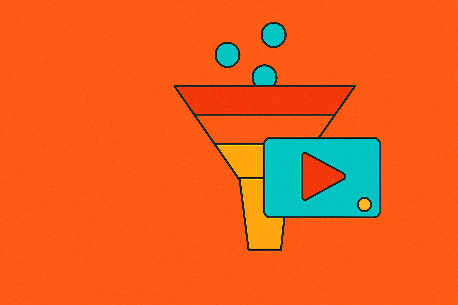
I've placed explainer videos in every stage of a SaaS funnel over the years, and the mistake I see most often has nothing to do with production quality. It's placement. Teams build one video, and one message, and then wedge it onto the homepage, the pricing page, an onboarding email, and a sales deck, expecting it to do four different jobs at once. That approach can't work. A stranger who's never heard of your product needs something completely different from a buyer who's three calls deep with your sales team, and the video that works for one will fall flat for the other.
Video isn't optional anymore either. Per Wyzowl's 2026 report, 91% of businesses now use video as a marketing tool, so having one isn't a differentiator. Where you put it, and what job you ask it to do there, is what separates a video that converts from one that just sits on a page looking nice.
How a SaaS funnel actually moves buyers, and where video can intervene
Every SaaS funnel moves through the same four stages: awareness, consideration, decision, and onboarding or retention. Awareness is a stranger encountering your brand for the first time. Consideration is a prospect who knows they have a problem and is now comparing solutions. Decision is someone close to picking a vendor, weighing final objections. Onboarding is a brand-new customer, already paying, trying to figure out if this thing actually works for them.
SaaS is harder to sell at every one of those stages than a physical product is. There's no shelf presence, no box to pick up, no demo unit to touch. Value is conditional: whether your product solves a buyer's problem depends on their team size, their existing stack, their workflow quirks. Copy can describe a dashboard, but it can't replicate the feeling of clicking through one.
Here's where it gets interesting from a leverage standpoint. The trial-to-paid transition is one of the sharpest drop-off points in the entire SaaS funnel. People sign up, poke around for a few minutes, and vanish. That tells you something practical: video placed right before that trial starts, and right after, carries outsized weight compared to video anywhere else in the funnel.
The principle that should govern every placement decision is simple. Video's job at each stage is to reduce the specific friction that stage creates, not to repeat the same message at a lower volume. What makes video so well-suited to this work is that it can show the product moving, compress a messy multi-step workflow into a minute, and build trust at scale without a rep on a call. No other format does all three at once.
Top-of-funnel placements: where explainer video earns attention, not conversion
An awareness video has one question to answer, and it has less than 90 seconds to do it: what problem does this solve, and for whom? That's the whole job. Not pricing, not features, not "why we started this company." Just the pain, named clearly enough that the right person recognizes themselves in it.
This is feed territory. LinkedIn, YouTube pre-roll, Instagram Reels, blog embeds, an organic YouTube channel. People are scrolling, not searching, so the video has to earn attention before it earns anything else.
Length and format matter a lot here:
- 15 to 60 seconds is the range. Long enough to land the pain point, short enough to survive a scroll.
- Animation works well because it simplifies workflows that look chaotic in a raw screen recording.
- For pre-Series A companies, founder-led, low-polish video often outperforms anything produced. Authenticity beats production value at this stage, every time.
Slack's early awareness explainer is still worth studying. It didn't open on features. It told a relatable story: a chaotic team turns organized. That framing made it one of the most-shared B2B explainer videos of its era, and it helped drive real early adoption, not because the animation was fancy, but because the story was recognizable.
One rule I'd never break: never gate an awareness video. The goal is a discoverable, ungated library that compounds organic reach over time and makes your brand the place people go to understand the category, not just your product.
Also, don't measure this stage against the wrong yardstick. Awareness video isn't responsible for trial sign-ups or demo requests. Track view-through rate and click-through rate instead. Those tell you whether you're earning attention, which is the only job this placement has.
Homepage and landing page placement: where the classic 60-second explainer earns its keep
The homepage isn't an awareness placement. The visitor already found you, clicked through, and is standing on your page right now, deciding whether to keep going. The video's job here is to hold them, clarify what you actually do, and push them toward a next step.
The numbers back this up hard. SaaS websites with a product video average a 4.8% conversion rate, compared to 1.9% for sites without one, roughly a 2.5x lift. Per HubSpot, 38.6% of marketers name video the single most impactful element on a landing page. That's not a marginal edge.
A homepage explainer that works does three things in under a minute. It opens on the problem, not the product name and not a founding story. It shows the product in motion, even if just a few seconds of real interface. And it closes with one clear call to action, not three competing ones.
Keep it to 60 seconds. Vidyard benchmark data shows product demo videos hit a 65% average completion rate versus 40% for generic brand videos, and completion drops off sharply past 90 seconds on landing pages. People are still evaluating whether to stay on your site at all; don't test their patience.
HubSpot's Customer Platform explainer is a good structural model. Under a minute, it opens on the idea of a unified platform, moves into what that means for daily workflow, and closes with a clear next step. That shape travels well to almost any SaaS product.
Paid landing pages need a tighter version of this. Paid traffic is colder and more skeptical than organic, so the video there should mirror the ad's exact promise and get to the value demonstration faster, with less scene-setting.
The generic explainer trap shows up constantly at this placement. Category-level language, "the future of work," "reimagining collaboration," doesn't tell anyone what your product actually does differently. The homepage video that converts is built around your real differentiator, not a template borrowed from a competitor's site. Track time on page and demo request rate, because if the video holds attention but nobody clicks through, it's still failing.
Email sequences and blog embeds: consideration-stage video that advances the relationship
Nurture emails go to people who opted in but haven't converted. They already know who you are. Sending them the homepage video again just tells them you have nothing new to say, which is close to the worst thing a nurture sequence can communicate.
Three formats earn their place in this stage:
- Feature deep-dives: one capability, walked through in enough detail that the prospect sees how it fits their specific context.
- Use-case videos: "here's how a team like yours uses this." Narrowing the audience like that increases relevance fast.
- Short social proof clips: one customer, one outcome, 30 to 60 seconds. Lighter weight than a full case study, but it still lands.
There's a lead-scoring signal buried in here that's worth setting up if you haven't: a lead who watches more than 60% of a consideration-stage video is a stronger buying signal than a page visit. That completion threshold is worth wiring into your lead scoring and routing straight to sales when it fires.
Blog embeds work the same logic from a different angle. A post that already ranks for a problem-aware search query answers "what is this?" The embedded video answers "how does it work?" Together they cover both halves of the question a prospect is actually asking.
And the payoff is measurable: video used at the consideration stage shortens B2B sales cycles by 23% on average, largely because it improves message retention and builds trust faster than text alone. Since the viewer has already opted in, you can afford more depth here, 60 to 120 seconds, without losing them.
Sales decks, follow-up emails, and digital sales rooms: video as a closing tool
By the decision stage, the buyer has already evaluated the category. They're choosing between vendors now, not deciding whether they need a solution at all. The video's job flips entirely: it's about removing objections, not educating.
Three formats carry weight here. Customer testimonial videos, specific and outcome-focused, from a customer archetype the buyer recognizes as similar to themselves. Zebracat's 2026 dataset found SaaS free-to-paid conversion running at 46% when testimonials were part of the flow, versus 27% for demo-only sequences. Use-case demos that walk through the exact workflow the buyer will use, including the integrations that matter to them, not a generic product tour. And ROI walkthroughs for enterprise deals, where someone on the buying committee needs the economic case spelled out in plain numbers.
The Crazy Egg case is one of the clearest examples of specificity beating polish that I know of. A whiteboard-style explainer, nothing fancy, placed at the decision stage, drove a 64% lift in conversion rate and added $21,000 a month in new revenue. It paid for itself in the first month. Nobody remembers that video for its animation. They remember it because it answered the exact question the buyer had.
Per Think with Google, 70% of B2B buyers watch video during their purchase decision. If your sales rep sends a plain-text follow-up email at this stage with no video attached, they're skipping the format buyers are already reaching for on their own.
Length rules loosen here. A decision-stage demo can run 2 to 5 minutes, because the person watching is already invested in the outcome. Place these on pricing pages, trial confirmation pages, follow-up emails, and inside digital sales rooms, anywhere a buyer is actively weighing the choice in front of them.
Gating also flips at this stage. Gating a detailed demo or a pricing walkthrough behind a form is reasonable here; the prospect is already evaluating, and a contact form is a small step toward a conversation, not a wall. What kills decision-stage video is using awareness-level messaging in this spot, category talk when the buyer just needs confirmation they picked the right vendor. Track conversion rate on the specific page or sequence, since that's the only number that matters here.
Post-sign-up placement: onboarding video that gets new users to a first win before they churn
Most SaaS churn happens in the first two weeks after sign-up. A new user opens the product, feels the gap between what they expected and what they can actually figure out how to do, and quietly stops logging in. Nobody sends an angry email; they just disappear.
Onboarding video's only job is to close that gap fast: get the user to one meaningful outcome, not explain every feature in the product. This isn't a sales pitch. The sale is done. The audience is a customer now, and the tone should reflect that shift.
Three places this lives well. The in-app welcome screen, short and action-oriented, the first thing a new user sees. The onboarding email sequence, triggered by inactivity or setup milestones, one video per email with one job each. And the help center, with feature-specific clips that surface right when a user encounters that feature, not buried in a general tutorials page.
Format matters less here than clarity and speed. Short "first win" walkthroughs, animated setup guides, quick how-to clips. Polish takes a back seat to getting someone unstuck in under a minute.
When onboarding video is missing, users fall back on documentation, open support tickets, or just leave. That's not a marketing metric slipping; that's revenue walking out the door from someone who already paid you. And there's an upstream effect worth naming: a user who reaches their first win fast is far more likely to explore other features, upgrade, and eventually tell someone else about the product. Onboarding video isn't just an activation lever. It's the earliest lever you have for expansion revenue too.
Matching video length and specificity to funnel stage
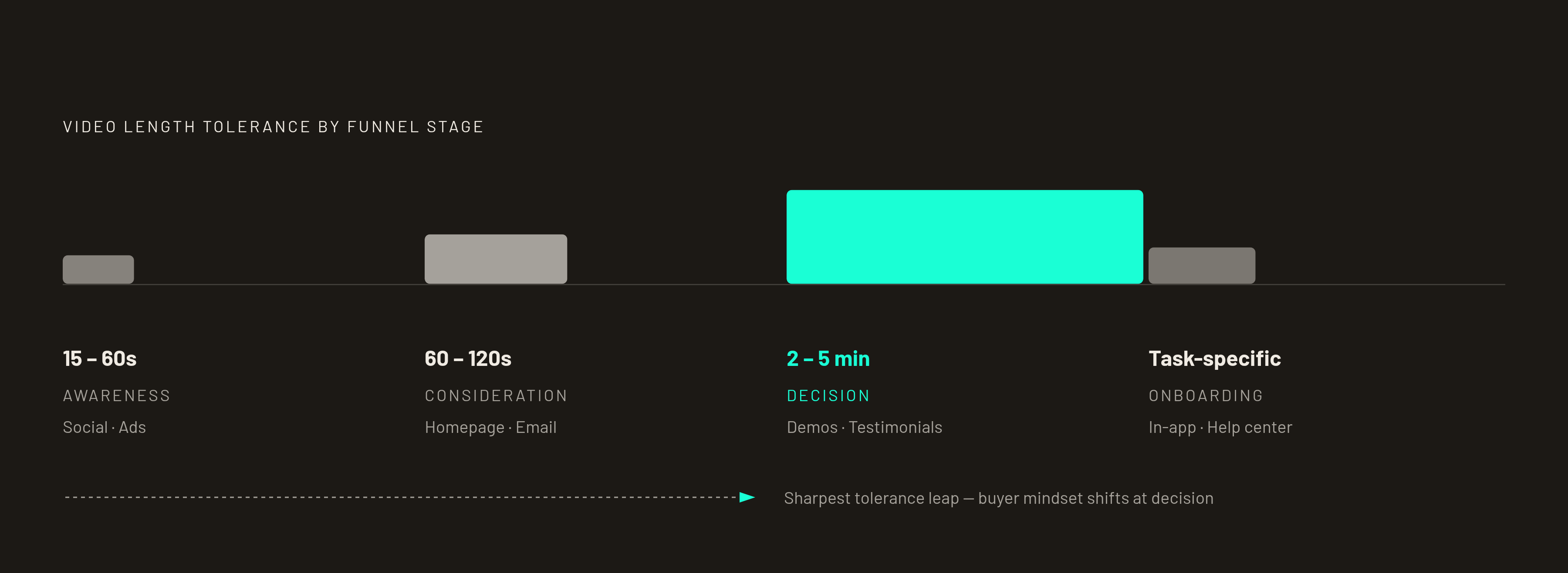
Length tolerance tracks with how invested the viewer already is. A stranger scrolling a feed gives you 15 to 30 seconds. A buyer comparing vendors on a pricing page will sit through 2 to 5 minutes, because they need the information to make a real decision.
Here's the map, stage by stage:
- Awareness (social, ads): 15 to 60 seconds.
- Consideration (homepage, landing pages, email): 60 to 120 seconds, with 60 seconds as the target for your highest-traffic pages.
- Decision (demos, testimonials, sales follow-up): 2 to 5 minutes.
- Onboarding (in-app, help center): short and task-specific; the task sets the length, not a general rule.
Length is only half the equation, though. Specificity is the other axis, and it matters just as much. A 60-second video that could describe any product in your category will underperform a 60-second video built around what your product actually does differently, and that holds true at every single stage.
Here's a test I run on every video before it ships: could you swap in a competitor's name and have the whole thing still make sense? If yes, it's not specific enough for wherever you're about to put it.
The format has both reach and influence on its side. Per Wyzowl's 2026 report, 96% of people have watched an explainer video to learn about a product, and 85% say a video convinced them to buy. Video isn't the limiting factor anymore. Placement and specificity are. So the brief for any new video shouldn't start with "we need an explainer video." It should start with "what stage is this for, and what's the one job it has to do."
How to audit your current video placements before producing anything new
Before anyone commissions a new video, walk the funnel you already have. The most common finding, almost every time, is an awareness-style explainer sitting on a pricing page, or a detailed decision-stage demo buried behind a gate on the homepage where nobody's ready to hand over their email yet. Mismatched placement shows up far more often than missing video altogether.
Run each placement through four questions:
- What stage of the funnel does this placement actually serve? Who's arriving here, and what do they already know?
- What's the single job this video needs to do, right here?
- Does the message, the length, and the specificity match that job?
- Is the KPI you're tracking even the right one for this stage? Conversion rate on an awareness video, or view-through rate on a pricing-page demo, will both hand you conclusions that lead you astray.
If your whole funnel needs video and you're starting from zero, don't spread your budget evenly across every stage. Find where the funnel is leaking the most people right now, and put your first video there. That's the placement with the most room to prove itself, and the fastest path to showing the rest of the organization that this was worth doing.