Teaser Videos for B2B SaaS Pre-Launch Campaigns
Teaser videos spike anticipation before launch by naming the problem and withholding the solution.
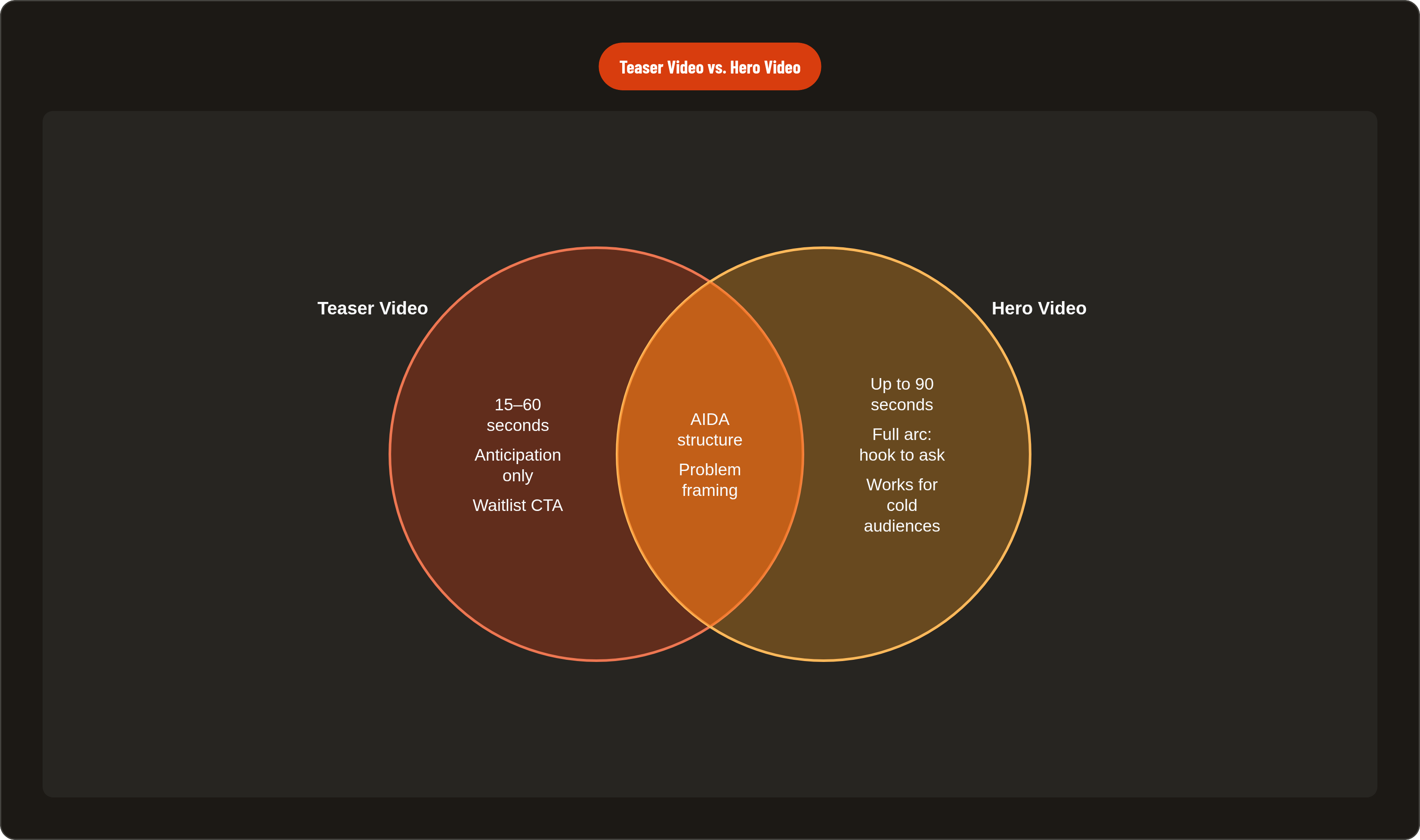
A teaser runs 15 to 60 seconds and goes out one to three weeks before launch. Its only job is anticipation: problem, hint at a solution, launch date, a nudge toward the waitlist. That's the whole assignment. Teams keep trying to cram a product walkthrough into that window, and it falls apart every time, because a walkthrough is a different video answering a different question.
The mix-up I run into most is teaser versus hero video. The hero video lives on the landing page, can stretch to 90 seconds, and has to complete the whole arc: hook, problem, solution, benefit, ask. Somebody forwards it around the office, it lands in front of a decision committee where half the room never fit the target audience in the first place, and it still has to work cold for a stranger who's never given your category a second thought. A teaser carries a lighter load, built for the scroll, meant to spike curiosity rather than settle it.
A demo is its own animal too, and worth separating out plainly. A demo walks through workflow, click by click, while a teaser just shows that a better world exists somewhere past the friction, without explaining the mechanics of getting there. B2B buyers won't engage with your UI until they believe you actually get the bottleneck keeping them up at night, so that belief has to come first, and the interface conversation can wait.
Underneath all of it sits one rule I keep coming back to after watching enough of these misfire: the teaser should make the wait for the full thing feel worth something. Run two or three weeks of teaser content on social before the hero video drops, and that hero video lands in front of people already leaning in. Skip the setup, and your launch video ends up doing two jobs at once, cold open and full pitch, which is a heavier lift than most teams plan their budget around.
The one thing a teaser must communicate in seconds
Median watch time on a B2B video ad sits at 5.86 seconds, and that's the whole window. Whatever makes your product different has to land before a thumb decides to keep moving.
Generic category language dies in that window, every single time. "Manage your team better." "Close more deals faster." Every competitor says some flavor of that same sentence, and none of it creates a reason to join your waitlist over anyone else's. What has to surface instead is the one thing that makes this product genuinely different, the thing the buyer hasn't already seen solved a dozen times. Finding that is harder than it sounds, and it's usually not what the marketing deck wants to lead with.
Consequence over feature, every time. What becomes possible now that wasn't possible an hour ago? The angle that actually lands is the buyer's specific bottleneck, finally called by its real name, something closer to that than a mission statement dressed up in motion graphics.
The strongest examples share a structural move worth studying: instead of isolating a single feature, they surface how the product connects into a larger workflow. The integration itself carries the differentiation, pulled forward rather than any single piece pulled out of it.
What you cut matters just as much as what you keep, maybe more. Show the whole product before launch and you've killed the reason anyone signs up early. Name the problem, signal that a solution exists somewhere, and stop. Some teams push that restraint further than most would dare: no voiceover at all, just fast screen recordings cut to music. The product's own visual clarity does the talking, and the confidence to withhold narration entirely says something on its own.
One gut check before you lock a script, something I've learned to apply after watching too many teasers blur together: if your stated differentiator could describe a competitor just as easily, it isn't sharp enough yet. Keep rewriting until it's falsifiable.
How to script a 60-second teaser using the AIDA structure
AIDA, attention, interest, desire, action, has run direct-response advertising for over a century, and it still holds up for a 60-second B2B teaser, provided you respect what the format can actually carry.
Attention, 0 to 8 seconds. Open on the problem your buyer is already turning over when they wake up. Never open on a logo animation; plenty of viewers bail the second a video leads with branding over pain. The hook needs a named friction point, the exact moment things go sideways, something sharper than a vague wave at "teams struggle with X." One move that works well: three seconds of visual chaos to spike recognition, then release. The contrast itself is the hook.
Interest, 8 to 30 seconds. Agitate the cost of staying put. Wasted hours, revenue leaking quietly, friction between teams, ground lost to competitors who moved first. This runs on the Zeigarnik effect, the pull of an open loop; the viewer needs to know how the story resolves. Stop short of resolution on purpose, naming the cost without showing the cure yet.
Desire, 30 to 55 seconds. Hint at the transformed state, not the feature list. Show the after, the buyer's day once the problem's gone, without demonstrating the mechanism that got them there. Abstracted UI moments, outcome language, one decisive workflow beat, all of it beats a feature tour in this window.
Action, final 5 seconds. One low-friction ask. "Join the waitlist" or "Get early access" fits the moment; "Buy now" or "Book a demo" asks for far more than anyone's earned after 55 seconds of teaser. Match the CTA to where the viewer actually stands, not where sales wishes they stood.
For social cuts on LinkedIn or YouTube Shorts, cut down to 15 to 30 seconds, vertical, 9:16. And a lo-fi founder format, one person talking through a single "aha" moment straight to camera, often beats a polished cutdown in that placement, at least in the pattern I keep seeing across the ones that actually spread. Rough wins there more often than agencies want to admit.
Visual and production decisions that signal product quality without revealing it
UI abstraction is a decision, not something you skip because the schedule's tight. Most high-performing SaaS launch videos use abstracted UI: floating interface pieces, native OS chrome stripped away entirely. Very few show the full, unedited software window, because floating UI cuts the cognitive load on someone with eight seconds to decide whether they care. A crammed dashboard screenshot in a 30-second teaser does the opposite; it overwhelms instead of pulling anyone in.
Cursor movement carries its own signal, and it's chosen on purpose more often than people assume. Some teams go with hyper-smoothed, almost synthetic cursor motion, faster than a hand could realistically move, which reads as zero latency and premium performance. Others keep small human imperfections in the cursor path, which reads as authentic and approachable instead. Neither approach is an accident, so pick whichever matches what you're actually selling.
Even the CTA inside the video is a design choice, not an afterthought slide bolted on at the end. A stark, glowing "Join Waitlist" command terminal has become a developer-native trope, one that makes signing up feel like using the product itself. Ending on the brand logo alone and letting the platform's native caption link carry the click is the other route, but that only works once your brand is already recognized, so be honest about whether you've earned it yet. Whichever direction you pick, the waitlist link needs to look like it belongs to the same visual world as everything before it.
Length discipline matters more than most teams give it credit for. Shorter videos hold attention consistently better than long ones, and completion rates drop hard past the ninety-second mark, a pattern that shows up again and again once you start tracking it across campaigns. Default short for a teaser specifically, because incompleteness is the whole mechanism, and every extra second of runtime works against it.
How the teaser feeds the waitlist funnel and what to expect from it
The teaser's job is to push traffic toward a pre-launch landing page with a waitlist form, ahead of any trial or purchase ask. That page needs a clear value proposition, a mockup or short demo clip, and a signup form; the teaser is just the mechanism that fills it. Start building the whole thing four to eight weeks before launch. Compress that into four to eight days, and it shows in the finished product, every time.
The economics back this up. Customer acquisition cost in B2B SaaS has climbed into the hundreds of dollars per lead in most estimates, and cold-traffic conversion usually lands around 2% to 4%. Route that same traffic through a properly built waitlist funnel, and you're looking at 20 to 40 signups per 100 visitors instead. That gap is the financial case for doing pre-launch work at all, rather than skipping straight to launch day and hoping.
Video on the landing page compounds it. Pages with embedded video convert meaningfully higher than text-only pages, and for complex B2B SaaS products specifically, controlled tests have shown conversion lifts well over 100%. Video-first campaigns with lead-gen forms attached tend to convert at multiples of what a standard landing page pulls in.
Warming an email list through a teaser sequence changes launch-day numbers too. A cold list hit with a launch email out of nowhere opens around 15% to 25%. A list warmed through weeks of teaser content clears that by a wide margin, often landing in the 40% to 60% range.
Notion's AI waitlist pulled in a million signups in five weeks, and Superhuman built more than 180,000 signups on cultivated exclusivity alone. Those are outliers, not a baseline anyone should expect to hit, but they show the ceiling that opens up when the promise is sharp and the distribution is deliberate. Volume is only part of the story: companies using video in their marketing consistently report stronger lead quality than those that skip it. A waitlist filled through a strong teaser carries its own qualification built in, a group of people who already self-selected around the exact problem your product solves.
Where generic teaser videos break down for B2B SaaS specifically
B2B buyers don't respond to category-level messaging the way consumer audiences do. Most B2B decision-makers say they'd rather watch a product demo than read a whitepaper, because what they're hunting for is evidence you understand their world, ahead of any brand energy a video might try to offer instead.
The failure pattern shows up constantly once you've seen it a few times. A template-built teaser with stock problem visuals and a placeholder CTA says nothing about what makes the product different. A beautifully shot video that describes the category instead of the product gives a buyer zero reason to pick your waitlist over a competitor's. Production polish without product specificity reads as a company that hasn't fully worked out what it's selling, and buyers pick up on that fast.
There's a deeper problem sitting underneath, too, one that only becomes obvious after sitting through enough of these debriefs. A SaaS product solving a genuinely nuanced workflow issue can't get distilled into a good teaser unless somebody on the team has real, specific knowledge of what makes it different. "Saves your team time" is indistinguishable from every other productivity tool on the market, full stop. The differentiator that actually earns a signup is almost always structural: a workflow nobody else solved, an integration nobody else built, a speed nobody else can match.
The stakes run higher than they look on the surface. Most B2B decision-makers name video as the single most influential factor in vendor selection, so a weak teaser doesn't just fail to convert; it shapes a first impression that follows the product straight into the sales cycle. A generic teaser carries its own negative weight, the impression of a product that couldn't say, in thirty seconds, what makes it worth waiting for.
What it takes to build a teaser that does real pre-launch work
This is a distillation problem before it's ever a production problem. The hard part isn't filming or editing; it's finding the one differentiator true and specific enough to create real urgency in under a minute. That takes product knowledge deep enough to know what your competitors literally cannot say about themselves, well past a feature list pulled from the roadmap doc.
A few things the process needs, no exceptions, worked out the hard way across enough of these: one defined message, one problem, one consequence, one hint at the solution, with no feature list tacked on because someone in the room wanted their pet feature included. A hook written before anyone picks a visual style, so narrative drives production choices instead of the other way around. Deliberate UI abstraction that matches your positioning, premium and frictionless versus accessible and human, whichever is actually true. A CTA built into the product's own visual language, not bolted on as a closing slide. And format matched to platform: 30 to 60 seconds for the main teaser, 15 to 30 second vertical cuts for social.
The sequence around the video matters nearly as much as the video itself. Two or three weeks of teaser content on social before the hero video drops, each piece layering in a bit more problem context without ever resolving the story. Done right, the hero video lands in front of an audience already invested, rather than one meeting the product cold.
For smaller teams without a big production budget, here's what actually moves the needle more than money, and it's the part I keep having to relearn: message clarity beats production value nearly every time. A founder on camera walking through one genuine "aha" moment, shot rough and vertical on a phone, will beat a slick animated video built on generic messaging more often than not. What separates a teaser that does real work from one that just fills a content calendar comes down to whether the team behind it understood the product well enough to know exactly what not to show. Withholding, done on purpose, is worth committing to fully.